My Blog List

Thursday, 19 June 2014

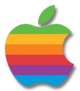
Variation of a well known logo apple

logos nowadays are more complicated and lots more futuristic for example, below I have two of the same logo but from different times;


The first picture show apples very first logo, this is very different from the logo that they have now. The old one is in black and white and looks like it has been sketched. This picture has a small link with apples because when you look at the picture, one of the first things you see is the man.

The second picture looks more futuristic because it has bright colours it also focuses the company name by having a icon as a apple. This shape is very well known and is still used by apple today just in a different colour.


Logo explained Ferrari

This is the Ferrari sports car logo, The first thing I notice when looking at it is the big black horse. This could represent horse power and speed, which are two of Ferrari's main objectives. The horse stands out because yellow background has a big contrast/clash with the black horse in the middle. The second thing that I notice about this picture is that it has the name of the company in big black writing at the bottom of the logo, This also stands out because of the big contrast of colours again. The last thing I saw on this logo was its green, white and red stripes at the top. These three colours are the same of the ones you would find on the Italian flag, This suggests that the company originally comes from Italy.


Logo explained Mcdonalds

McDonald's is a well known fast food restaurant and can be found nearly every where you go!
Their logo "The Golden Arches" Is recognized throughout the world.

You can probably see why it is called "The Golden Arches" as two yellow lines bent to form a arch way make the letter "M" which must stand for the company's name. The colours in this logo are very basic but have a big contrast. The yellow arches try to represent the colour gold as their professional name is "The Golden Arches"

Wednesday, 4 June 2014

What should a logo contain

A logo is a very important image for a business or company as it will be one of the best things for people to identify it by. A logo should contain something that will catch the users eye such as bright colours etc. The logo should also contain a company's name, or a product that they produce. A company's logo should be easy to memorize and understood by everyone. When making a logo the creator must think about what the logo is telling people and be aimed towards the target market is.